Project 05 of 09
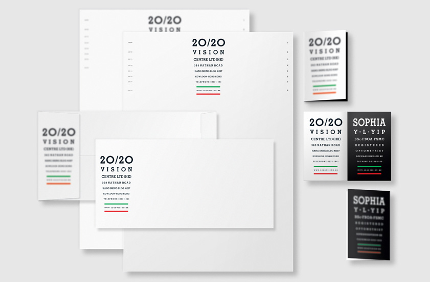
20/20 Vision Centre Ltd (HK) Stationery
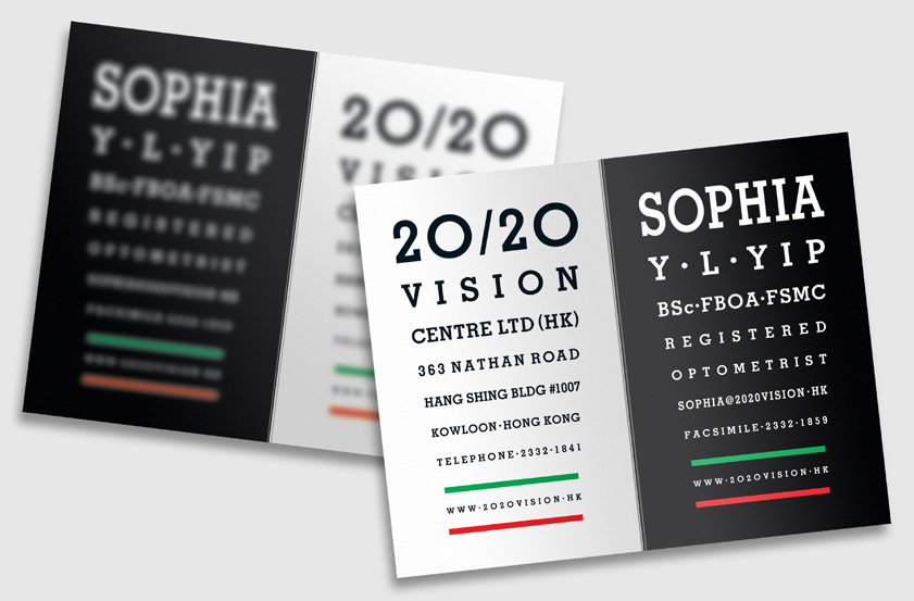
Image 01 of 02
20/20 Vision Centre Ltd is an optical firm providing highly accurate prescriptions for patients. Our solution uses the firm’s descriptive name in descending scale to create a classic eye chart, representing their commitment to helping patients attain 20/20 vision. The stationery’s blurred and clear letters symbolize the optometrist’s skill in bringing her patients’ vision into sharp focus, engaging the audience in discovering the crisp, clear forms of the company name and providing viewers with the experience of achieving 20/20 vision.
The letterhead's distance markings provide functionality, enabling its use as an actual eye chart to test one’s vision. The business card’s blurred outside and clear inside and contrasting black and white panels convey the successful correction of one’s vision as the difference between night and day.
Recognition
Communication Arts Design Annual 52, 2011
Graphis Letterhead 8 (Silver), 2017
Creativity 41, 2011
American Graphic Design Awards, 2011
Spark Design Awards (Finalist), 2011
American Graphic Design & Advertising Awards 28 (Best of Category), 2012
San Francisco Center for the Book Be Enveloped! Exhibition, 2015
Hoffmitz Milken Center for Typography Collection, 2016
Letterform Archive Collection, 2017