Project 27 of 45
Nanocosm Technologies Logo
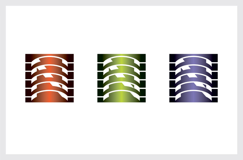
Nanocosm Technologies is an Internet commerce firm. Our solution uses a gradated vertical band to symbolize the “core nucleus” of financial information the firm offers customers.
Streaming bits of information flow over the core to reveal the letter “N” and create the illusion of depth. A bright color palette is used to distinguish the firm’s variety of financial offerings.
Recognition
Graphis Logo Design 5, 2001
Creativity 28, 1998
Global Corporate Identity, 2002
Logo 2004
Logo 2005
HBI The Big Book of Logos, 1999
Rockport Color Graphics, 2002
HBI The Big Book of Logos 4, 2004
LogoLounge Master Library, Vol. 1, 3000 Initial & Crest Logos, 2010
Counter-Print Alphabet Logo: Trademarks & Symbols, 2015