Project 26 of 45
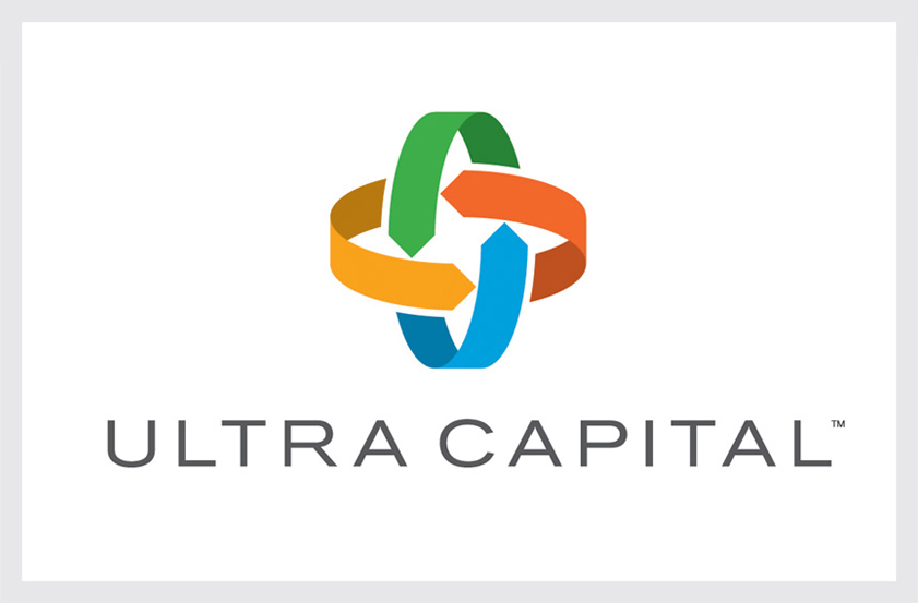
Ultra Capital Logo
Ultra Capital finances sustainable infrastructure and real asset projects which apply proven technologies in resource efficiency to deliver strong returns to institutional investors. Our solution utilizes intersecting arrows to symbolize the interdependent ecosystems of the regenerative, circular global economy.
The logo’s mobius structure conveys the concepts of continuity and sustainability, while the interconnected forms suggest a plus sign, symbolizing the potential for the firm’s sustainability-driven investments to grow and scale. The logo’s four colors represent the firm’s real asset sectors of agriculture, energy, water, and waste.
Recognition
Graphis Logo Design 9 (Silver), 2017
American Graphic Design Awards, 2015
Counter-Print Abstract Logo: Trademarks & Symbols, 2016
Graphis Logo Design 9 (Silver), 2017
American Graphic Design Awards, 2015
Counter-Print Abstract Logo: Trademarks & Symbols, 2016